Advanced Slider Pro Module
Elevate Your Site with the Advanced Slider for Unmatched Visual Impact and Smooth Transitions!
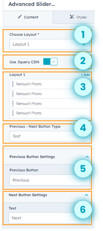
Layout 1
- Select either Layout 1 or Layout 2.
- users can choose to use Jquery CDN or not. when enabled, allows to load of the jQuery library from a Content Delivery Network (CDN) for faster performance and reliability. This helps ensure the slider functions smoothly without relying on a local copy of jQuery.
- Users can add multiple images to the slider.
- Users can select the previous-next button type according to their preferences.
- Add previous button text per the design needs.
- Add next button text per the design needs.
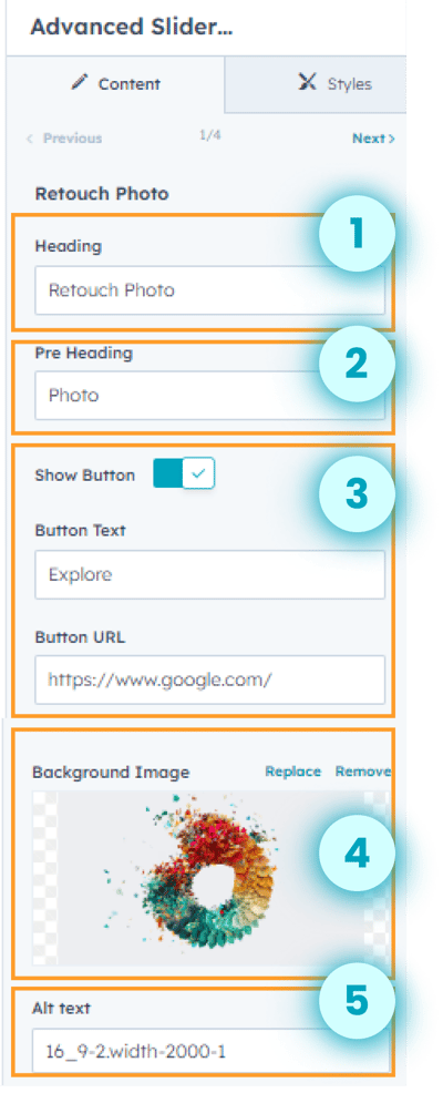
Customize the images for the slider.
- Add heading text.
- Add pre heading text.
- Show or hide button. Add button text and URL.
- Select a background image per the design needs.
- Add alt text for the image, enhancing accessibility and SEO
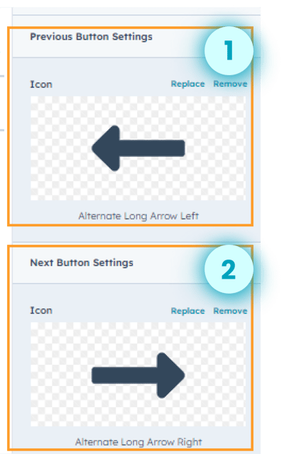
- Customize the previous button settings. Set icon per the design needs.
- Customize the next button settings and set the icon to fit the desired design needs.
.png?width=400&height=455&name=advanced%20slider%20ss%203%20(1).png)
- Customize the font size for the heading.
- Customize the text color for the heading text.
- Customize the text thickness for the heading text.
- Customize the font size of the pre heading.
- Customize the text color of the pre heading.
- Customize the font thickness.
.png?width=400&height=348&name=advanced%20slider%20ss%204%20(1).png)
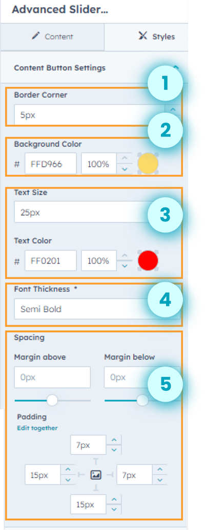
- Customize the border corner for the content button.
- Customize the background color for the content button.
- Customize the text size and text color for the content button.
- Adjust the font thickness.
- Configure precise margins and padding for the content button with this customizable feature.
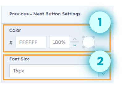
- Customize the color for the previous-next button.
- Customize the font size.
Layout 2
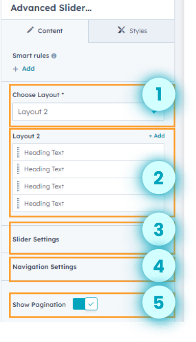
- Select layout 2.
- Customize the images for the slider for layout 2.
- Customize the slider settings for layout 2.
- Customize the navigation settings for layout 2.
- Show or hide pagination.
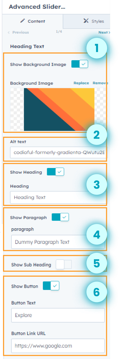
- Show or hide the background image. Set the background image to fit the desired design needs.
- Add alt text for the image, enhancing accessibility and SEO.
- Show or hide the heading. Add heading text to match the design perfectly.
- Show or hide the paragraph and add paragraph text.
- Show or hide the sub-heading.
- Show or hide the button. Add button text and button link URL.
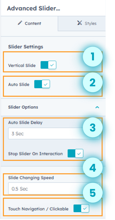
- Users can select vertical slide according to their preferences.
- Users can auto-slide the images.
- Adjust the time for auto slide delay.
- Stop the advanced slider on interaction by enabling the stop slider on interaction feature. This ensures the slider pauses when the user interacts with it.
- Adjust the slide changing speed.
- Enable or disable touch navigation/ clickable according to preferences.
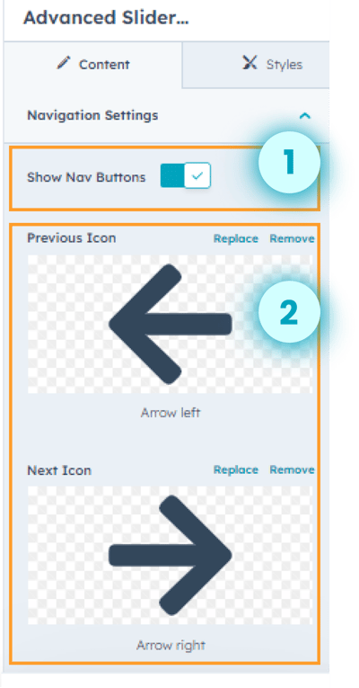
- Show or hide navigation buttons.
- Set the previous icon.
- Set the next icon.
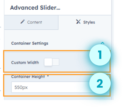
- Users can customize the width of the container.
- Adjust the width of the container.
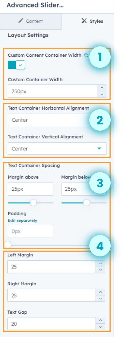
- Customize the container width.
- Adjust the text container's horizontal and vertical alignment.
- Adjust the margin and padding around the layout.
- Adjust the left margin, right margin and text gap for the layout
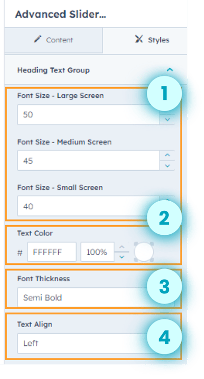
- Adjust the font size of the large screen, medium screen, and small screen for the heading text group.
- Customize the text color of the heading text group.
- Adjust the font thickness.
- Adjust the text alignment.
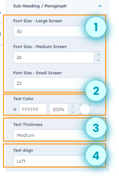
- Adjust the font size of the large screen, medium screen, and small screen for the subheading/ paragraph.
- Customize the text color of the sub heading/ paragraph. .
- Adjust the text thickness.
- Adjust the text alignment.
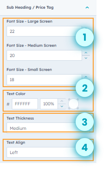
- Adjust the font size of the large screen, medium screen, and small screen for the subheading/ price tag.
- Customize the text color of the sub heading/ price tag. .
- Adjust the text thickness.
- Adjust the text alignment
- Adjust the spacing and padding around the button group.
- Customize the background color and text color for the button group.
- Adjust the font size of the large screen, medium screen, and small screen for the button group.
- Adjust the font thickness of the button group text.
- Adjust the alignment of the button group.
- Customize the border style, color, width, and border corner for the button group.

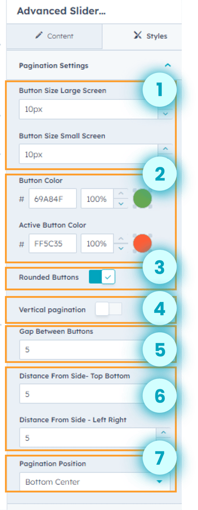
- Adjust the large screen and small screen button size.
- Customize the button color and active button color for the pagination.
- Enable or disable the rounded button.
- Enable or disable vertical pagination.
- Adjust the gap between buttons.
- Adjust the distance from the side- top bottom and side- left-right.
- Adjust the pagination position per the design needs.
- Select the slide controller button layout.
- Show or hide the background color.
- Customize the background color and button color for the navigation button setting.
- Adjust the top-bottom gap, left-right gap, and button gap for the navigation button settings.
- Enable or disable rounded buttons for the navigation button group.
- Adjust the top bottom and left-right padding around the navigation button.
- Customize the border style, color, width, and radius for the navigation buttons.
.png?width=350&height=1224&name=advanced%20slider%20ss%2018%20(1).png)
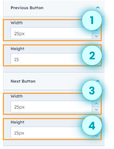
- Adjust the width of the previous button.
- Adjust the height of the previous button.
- Adjust the width of the next button.
- Adjust the height of the next button.